Loan Purpose Expansion
B2C Product Design


Associate Product Designer
Lindsay Trump
My Role:
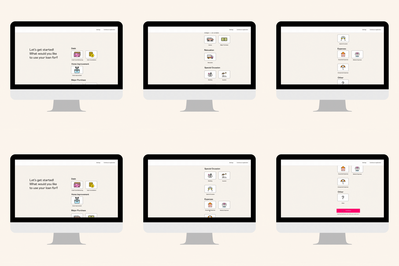
LPE Mobile + Desktop Screens
Other Team Members
Laura Zinssmeister, Director of Product
Tools Used


The Problem:
New applicants were looking to Happy Money for other loan types besides credit card consolidation.
The Solution:
13 categories were decided on by Marketing to start experimenting with. These categories were decided by polling current Members to see what other loan types they would be interested in or wish they could have applied for at the time of applying for a Happy Money loan. My role was to create the most efficient layout for all new loan types.
The Process
Exploration
I started with researching other companies to see how they were presenting all of their options for different loan types.

Once I was able to do some research, I decided to make multiple different variations of the LPE dropdown, starting with a traditional dropdown option.


User Testing
Once all versions were complete, I partnered with our User Research team to conduct tests on which versions would be best to move forward with. The 2 we decided to test were the traditional dropdown and the square icons but on a Mobile page. I also partnered with my Manager to decide on the hierarchy and how the loan types should be categorized. (User Research also did similar tests later on down the road).

V.1

V.2

Final Designs


From the test results, it was decided that majority of the people preferred the icons and visual cues for the LPE. We were then able to add some branding to make it more appealing to the eye.
Questions
-
How can we condense the categories to also condense the page space?
-
What loan types are not performing that we can remove from the funnel?
What's Next
I would have loved to create a condensed, more concise version that did not include a lot of scrolling for the Users. Additionally, I think the desktop page could have used some additional illustrations so it is not as plain.
